
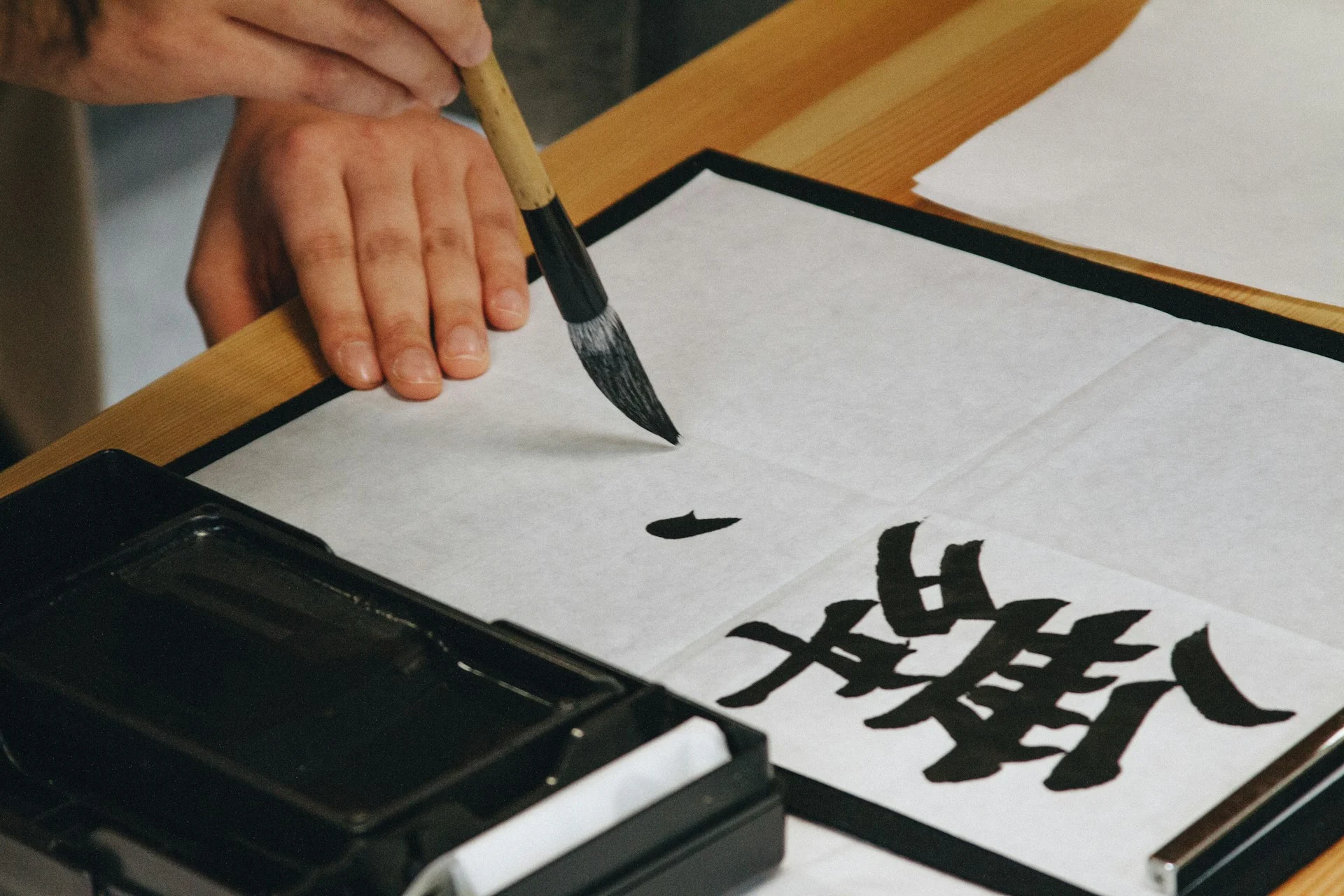
An AI calligraphy generator posted to V2EX on 25 October 2026 turns any poem you paste into a page of small regular script (xiaokai). The author says the result reaches about 90% of the original copybook. That figure is their own estimate, and nobody has independently tested it.
The project is called 刘春霖小楷书房 (Liu Chunlin Xiaokai Studio). It is more interesting for how it avoids looking typed than for any claim about “AI”.
Key takeaways
- The model script is the handwriting of Liu Chunlin (1872 to 1942 or 1944, sources differ), the last top scholar of imperial China.
- Three layers of variation and per-character spacing are meant to remove the “computer typeset” feel.
- Pages follow fixed layouts, such as 10×14 for seven-character verse.
- The repository states no license, so reuse terms are unclear.
- The “90%” is the author’s judgement, not a benchmark.
What does this AI calligraphy generator actually do?
You enter a poem or short prose. The system detects the title, author and form (five-character verse, seven-character verse or prose), then lays the text out on a framed page. A GitHub repository describes the project, and the author’s V2EX post links the live demo.
Text that is too long is cut to one page instead of throwing an error. The output carries a Song-brocade border and a QR code styled as a red seal. The page supports both simplified and traditional characters in a 馆阁体 (official “hall style”) look.
How does it avoid the typed-font look?
A normal font gives every “人” the same shape. A human hand never does. The author’s answer is a three-layer dynamic engine plus smarter spacing:
| Layer | What it varies |
|---|---|
| Variant glyphs | Several shapes of the same character, rotated using Unicode’s Private Use Area (code points reserved for custom use) |
| Component tweaks | Small shifts in parts of a character, such as a radical |
| Brush field | Elastic stroke effects and simulated ink-loading variation |
| Vertical kerning | Spacing from each character’s real bounding box, not a fixed grid |
Kerning means adjusting the gap between letters. Here it runs down the column, so a narrow character like “一” does not float in a full-size cell.
The Private Use Area trick is common but debated. Type designers on TypeDrawers note it breaks search and spell-checking, and shows garbage if the font is missing. That matters little here, because the final product is an image.
Is it really AI, or clever font engineering?
This is my reading, so treat it as opinion. The repository describes glyph variants, layout rules and a rendering server. It does not describe a trained neural network. The author says the system learned the structure of a real copybook, but I could not verify what “learned” means in practice.
Academic work takes a different route. A 2017 paper on auto-encoder guided GANs maps standard fonts to calligraphic styles. DeepCalliFont (AAAI 2024) combines image and stroke-sequence models for few-shot synthesis. DP-Font (IJCAI 2024) adds a physics model of nib movement and ink diffusion.
The V2EX project sits closer to a crafted rendering pipeline. That is not a criticism. A narrow, well-built tool often beats a general model on a single style.
Who was Liu Chunlin, and why use his hand?
Liu Chunlin (刘春霖) was the last zhuangyuan, the top scorer of China’s imperial examinations, in 1904. Bonhams catalogues list his work, and his small regular script became a classic model for students. Clean, even strokes make it a good target for a system that must stay consistent across thousands of characters.
What are the limits and risks?
- Licensing: no license is stated, and the fonts come from a copybook, so commercial use is a question mark.
- Access: the fonts sit on a private server, with no font files in the public repo. Free use is capped at 10 works per IP per hour.
- Evidence: the V2EX post mentions blind comparisons, but I found no published test method.
The pattern is familiar from our coverage of Duetto, a model that plays piano with you: AI aimed at a craft, judged by how human it feels. It also echoes the vibe coding paradox, where building is cheap but standing out is hard.
What happens next
Watch the repository for a license, a published comparison method and any move toward other copybooks. If the author opens the engine, other hands (regular, running or cursive script) could follow. If they do not, expect imitators, since the layered-variation idea is easy to copy.
FAQ
Is the generator free?
Yes, within a cap of 10 works per IP per hour, according to the project page.
Does it support traditional characters?
Yes. The page lists both simplified and traditional character sets, and the author’s demos include traditional-character works.
Can I use the output commercially?
Unclear. No license is stated, so ask the author before selling or printing work at scale.
Next step: paste a favorite Tang poem into the demo, then compare the page with a printed copybook and judge the 90% claim yourself.
Leave a comment